
-
Client
After.com
-
Services
Product Strategy, Wireframing, UI/UX Design
-
Design Timeline
2 Months
-
Brief
Productize the growing Pre-planning insurance product for After.com, a newly minted Series A startup with massive growth.
Project Background
After.com had just raised $10 million. Their first move was to start targeting low-hanging fruit with a maximal ROI and a low development LOE. Despite their pre-planning insurance product being their 2nd highest revenue producer, it had been stuck in the validation phase since conception. The product was effectively a lead-gen form and a large sales team. The expensive costs and low UI maturity suggested juicy efficiency and ROI gains.
The Market
After.com is disrupting the $20 billion funeral market, a rough patchwork of large national funeral homes and thousands of local, independent players, all with different pricing and business models. In the last few decades, a seismic shift happened across the funeral industry with the popularity of cremations exploding to 60% (expected to grow to 80% in the next decade). Cremation allows a digital service like After to challenge the overpriced, staid status quo and produce a simpler product with the same level of care and compassion.
Project Goals

Convert on Day 1
-
The digital insurance industry is well established for overlapping products such as life insurance (players like Ladder and Ethos). The goal was to design a product piggybacking on these trailblazers that would convert well day 1 and be easy to implement.

Be Empathetic
-
After.com has a unique customer base. Often the customer is older for the core funeral product. However, there is also a younger persona that are interested in the pre-planning service. These people are at one of the lowest points in their lives, so understanding their unique needs and compassion for them is paramount.

Save After.com $$
-
With 10 full-time sales reps, the amount of effort & time, and thus money, that went into each sale was high. By productizing the sales flow, we hoped to increase the volume of sales, reducing time and effort per sale for the sales team (while not eliminating them for those customers who prefer that sales process).
After.com Personas
Interviewing with multiple sales reps and looking at the data showed that there were two primary personas for the pre-planning service. An older customer who was planning for themselves, a spouse, or a sibling, and a younger customer who was most likely planning for a parent. These two personas had very little overlap in demographics and digital product preferences, though there was less difference in device type than you’d expect (almost an even split between desktop and mobile).

Best Practice Analysis

Address customer’s biggest objections upfront through clear communication

Use social proof paired with friendly language and graphics

Give process guidance and steps
Dynamic, snappy forms for quick responses and low friction
Wireframes
The goal of wireframing on this project was to produce low/mid-quality screens as quickly as possible to check:
Trialing methods of incorporating After’s somewhat haphazard marketing design system (no design system)
To structure the core beats of the “sales” funnel as a part of the product
To trial different layout options that could utilize the limited screenspace available as best as possible


I focused a lot on space utilization, allowing space for compassionate communication, and emphasizing emotion in the sales process.

The Results
I designed a process that is not only easy to use but compassionate in its execution.
Despite this product being new to the funeral planning industry, I utilized best practices to design a flow that should convert at a high rate while allowing for future optimization as data rolls in. Additionally, I created an engaging dashboard for customers as their primary touchpoint with the app.
The end result is beautiful, dynamic, and functional. It should dramatically reduce load on the sales team and enable scale.
Initial Intake Flow
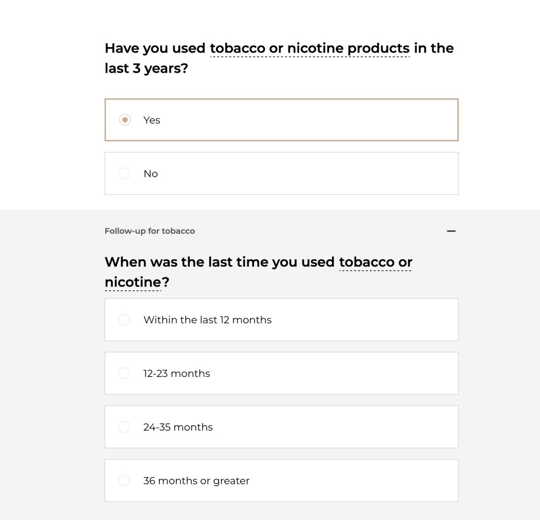
The goal of the intake flow was the utilize best practices in the digital insurance space while leaving room for After.com’s unique brand voice and implementing communication and marketing opportunities at strategic points.
Additionally, I hoped to ensure the process was dynamic and snappy with as few screens as possible. We had to ensure that we collected the right data to provide an accurate quote, but we worked to minimize the number of questions and screens as much as possible, reducing distance to the quote.


Capturing Brand Voice
Capturing Brand Voice

After had cultivated an incredible brand voice utilizing detailed, vibrant illustrations and a strong sense of visual identity. However, they had yet to develop a core software product that implemented a sense of this brand voice in a written sense.
I knew that because of the sensitive, emotional nature of funeral planning, it was critical to reserve lots of space for the written word, allowing the company to communicate with compassion directly to customers while continuing to utilize their exceptional illustrative assets to their fullest extent.
Checkout Flow
The goal here was similar to the intake flow - utilize best practices to ensure a smooth, high-converting quote and checkout flow. There were relatively strong guardrails here - I didn’t have any input over the plans, as well as the number of screens or type of questions that were required.

The checkout flow required the ability to select between an entire lump-sum payment vs. selecting a monthly payment vs. a small downpayment. These options represented a unique checkout flow challenge due to the addition of interest payments.
Strategically on these screens, we wanted to emphasize the pay-over-time options, since they converted at a higher rate, and also earned after.com more revenue. We further incorporated small UI elements reminding the customer about After.com’s price lock, where you pre-pay for a cremation with no risk of a price increase when it is needed.

Custom Splash Animation Storyboard
Setting up a policy from start-to-finish represented a significant chunk of work for the customer.
I identified a need for something to celebrate this work. Additionally, finalizing a policy necessitated preparing a slate of documents that took between 30 seconds to 2 minutes to prepare. The customer’s policy would not be complete until these documents were signed.
Because of the delay, I theorized that implementing a celebratory splash animation would allow the back end to catch up and prepare documents while providing a positive user experience and building additional brand value. The final storyboard for that animation is below.

Management Dashboard
The requirements for this part of the project were the most ill-defined. We were building a part of the product that users had not directly asked for, nor had ever been conceptualized or built before. To better define requirements I interviewed multiple sales team members who gave us clear insights into some of the core actions users wished to accomplish after they’d purchased a plan. These included:
Share their plan with family members
Download their documents
Find contact information (i.e. plan phone numbers)
Request replacement cards
We hypothesized that customers would want a central location to manage all of their plan information, including the above. Strategically, this centralized dashboard represented an additional opportunity to upsell customers into future products like estate planning and power of attorney.


